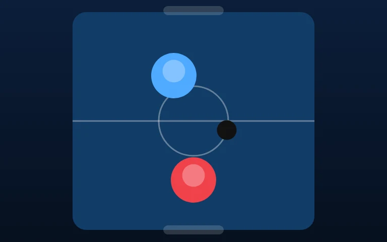
Most discussions of game colour treat it as aesthetics. In practice, colour is the primary channel through which a player reads the game state — and when it fails, the game becomes unplayable before it becomes ugly.
The three channels
Players distinguish objects by three properties, in this order of reliability:
- Shape and size. Works for everyone, works at any distance, works in grayscale.
- Brightness. Works for almost everyone, degrades in bad light and on cheap screens.
- Hue. Works well for most, poorly for the roughly one in twelve men with red-green colour vision deficiency.
Designing only with hue means designing for the majority and, quietly, against everyone else. Adding shape redundancy — a dot in the middle, a distinct silhouette, a size difference — costs almost nothing and repairs the whole failure.
Two objects that must be told apart should differ in at least two of the three channels. One is a gamble.
Contrast is not decoration
Text and gameplay elements sit on backgrounds that move. A colour that reads perfectly on a static mockup can vanish the moment a bright sprite passes behind it.
Two rules that survive contact with reality:
- Never rely on hue for the critical readout. Score, lives, timer: high contrast, neutral colour, large weight.
- Test on the darkest and lightest frame. If a UI element disappears on any frame the game can produce, it is not readable.
The colour-blind checks worth doing
You do not need a simulator to catch the common failures. Three quick tests:
- Grayscale. Convert a screenshot. If two gameplay elements become the same grey, they are too close.
- Squint. Blur your eyes until details vanish. Whatever survives is what the player sees in motion.
- Peripheral test. Look at the centre of the screen while paying attention to the edges. HUD elements that vanish here are too low-contrast for a player who is watching the action.
Palette size
A small palette is a readability tool, not a limitation. Four to six hues, each with two or three values, is enough for most arcade games — and it makes "the red one" a meaningful instruction.
Games that use twenty hues end up with a board where nothing stands out, because everything does. Visual hierarchy requires scarcity.
Colour as a signal, not an identity
There is a useful distinction: colour can identify a category (all enemies are warm) or signal a state (it is now dangerous). The first is decorative and can be dropped for accessibility. The second is functional and must be backed up by something else — a flash, a sound, a change in motion.
If your game's only warning that something is now lethal is a hue shift, a colour-blind player never receives the warning.
The practical minimum
Every game should pass four checks before it ships:
- Readable in grayscale.
- Every critical element distinguishable by shape as well as colour.
- HUD text legible against the busiest background frame.
- No state change communicated by hue alone.
None of these make a game less beautiful. All of them make it legible — and a game nobody can read is a game nobody can play.